
Today is the fourth of four days painting with Susanne Kirsch. A workshop organized by Galerie EigenArt.

Let's see what will develop:
I'm curious!
Are you?
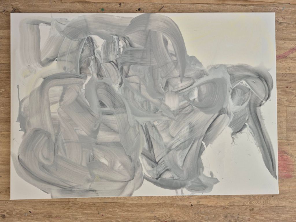
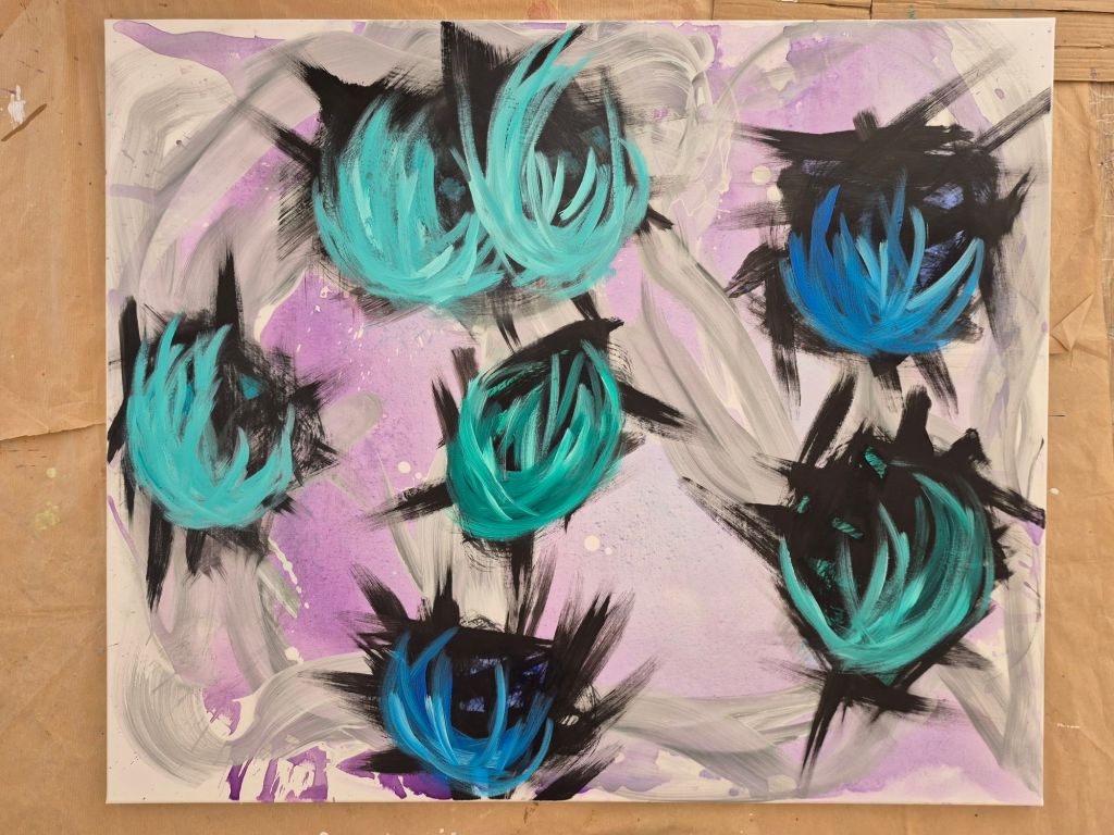
your opinion?
i'm curious.
![[ ja.]](https://ja-art.org/wp-content/uploads/2025/09/wlknlr3391008547215733766.png)

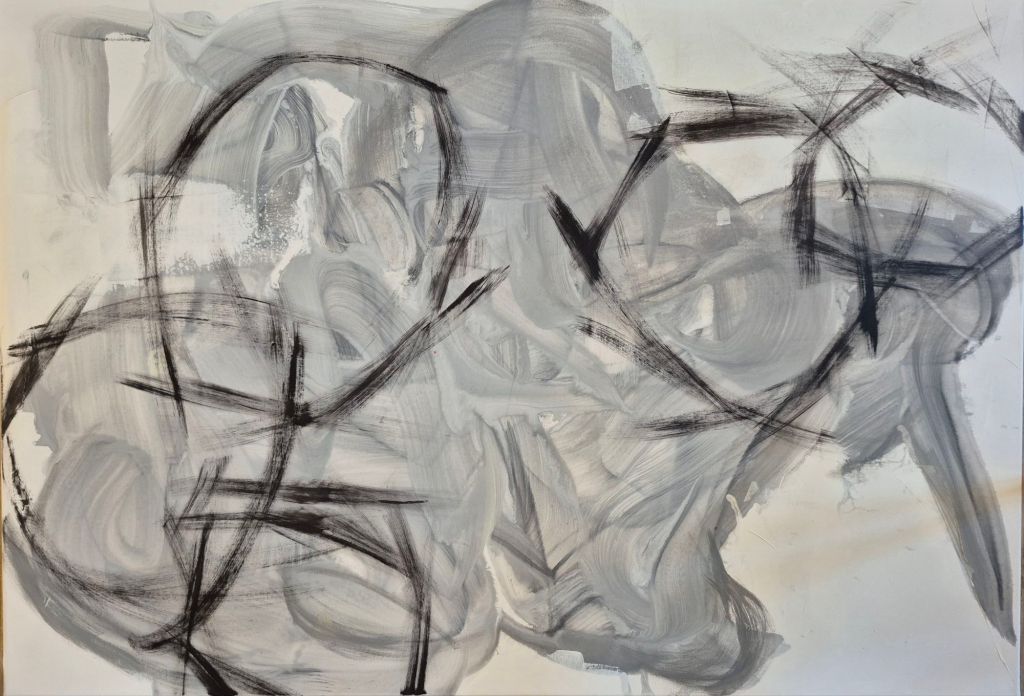
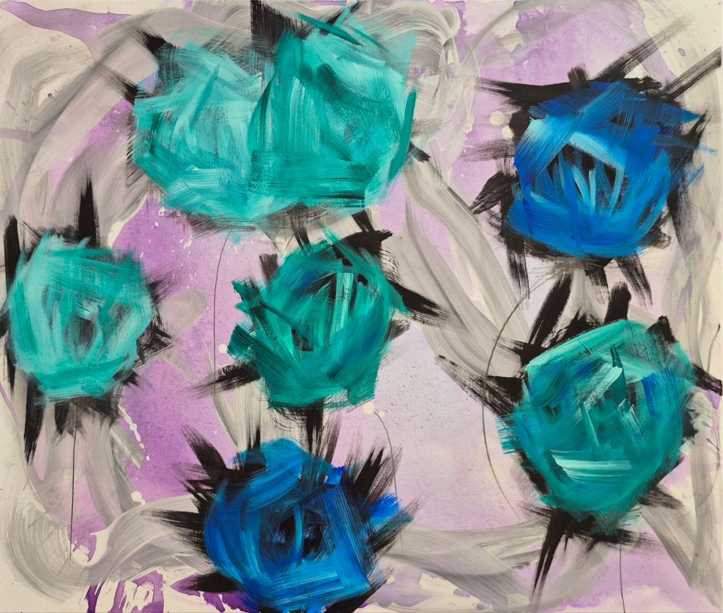
Today is the fourth of four days painting with Susanne Kirsch. A workshop organized by Galerie EigenArt.
Let's see what will develop:
I'm curious!
Are you?
your opinion?
i'm curious.
![[ ja.]](https://ja-art.org/wp-content/uploads/2023/10/wp-1696345224169.png)
PAiNTED art WRiTTEN

16 Antworten
[…] TWiNS|060 TRAVELLER HATS|CAPS |002 [iN PROCESS] iN BETWEEN [iN PROCESS] BLANK CANVAS [iN PROCESS] [iN PROCESS] TWiNS|061 HATS|CAPS |003 BLOOMiNG |001 TAKE HiM OH GOD LiKE SAND FRÜHLiNG TWiNS|062 SOMMER HERBST […]
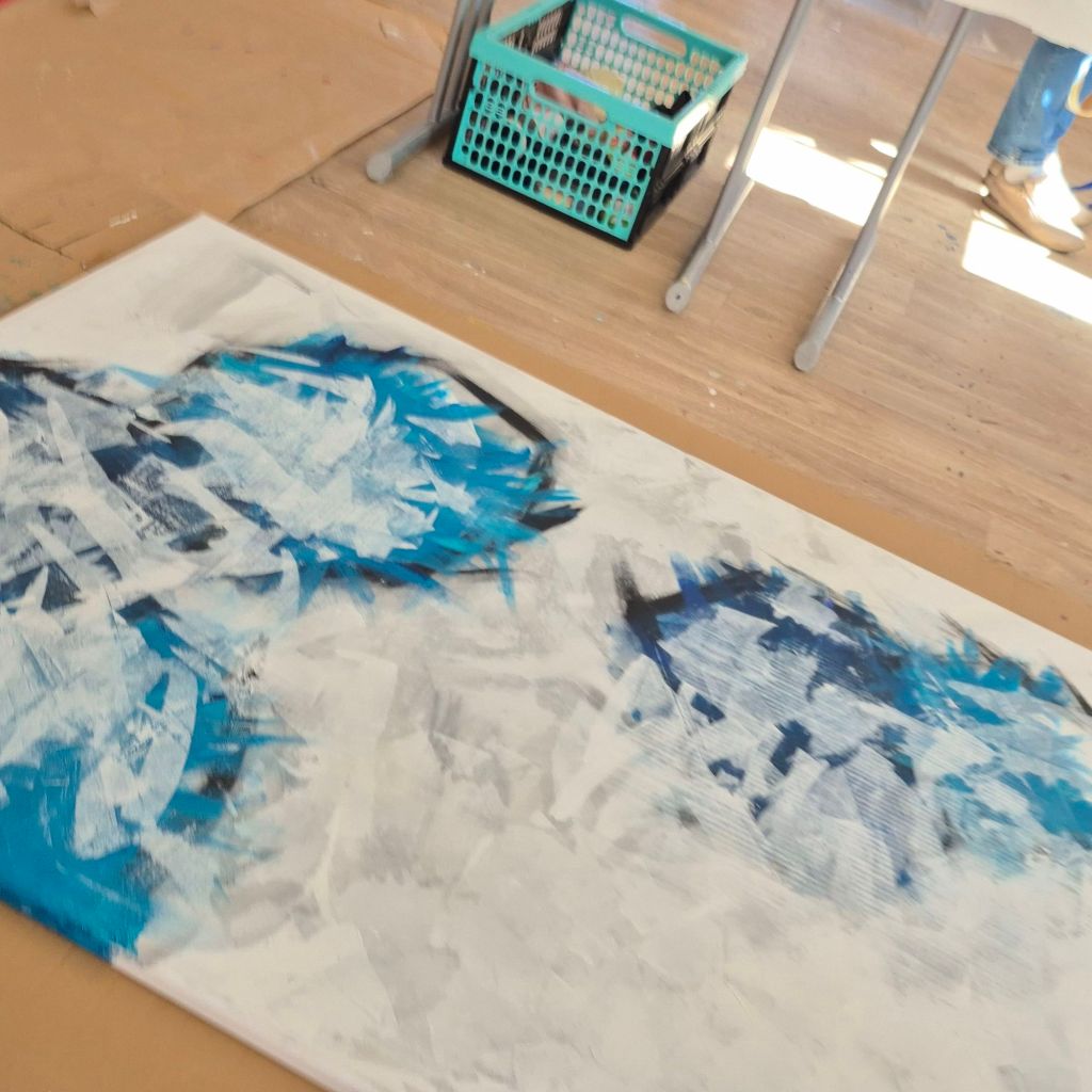
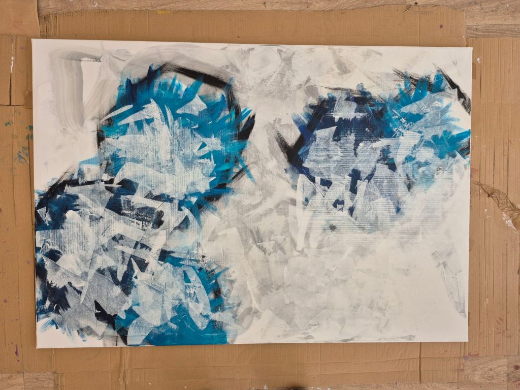
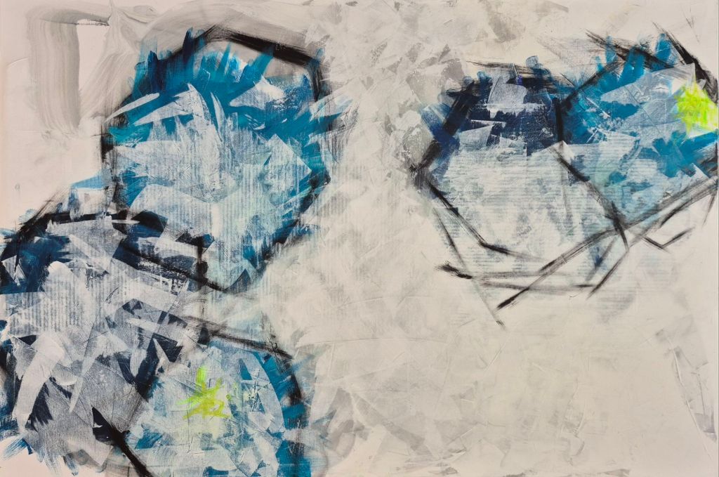
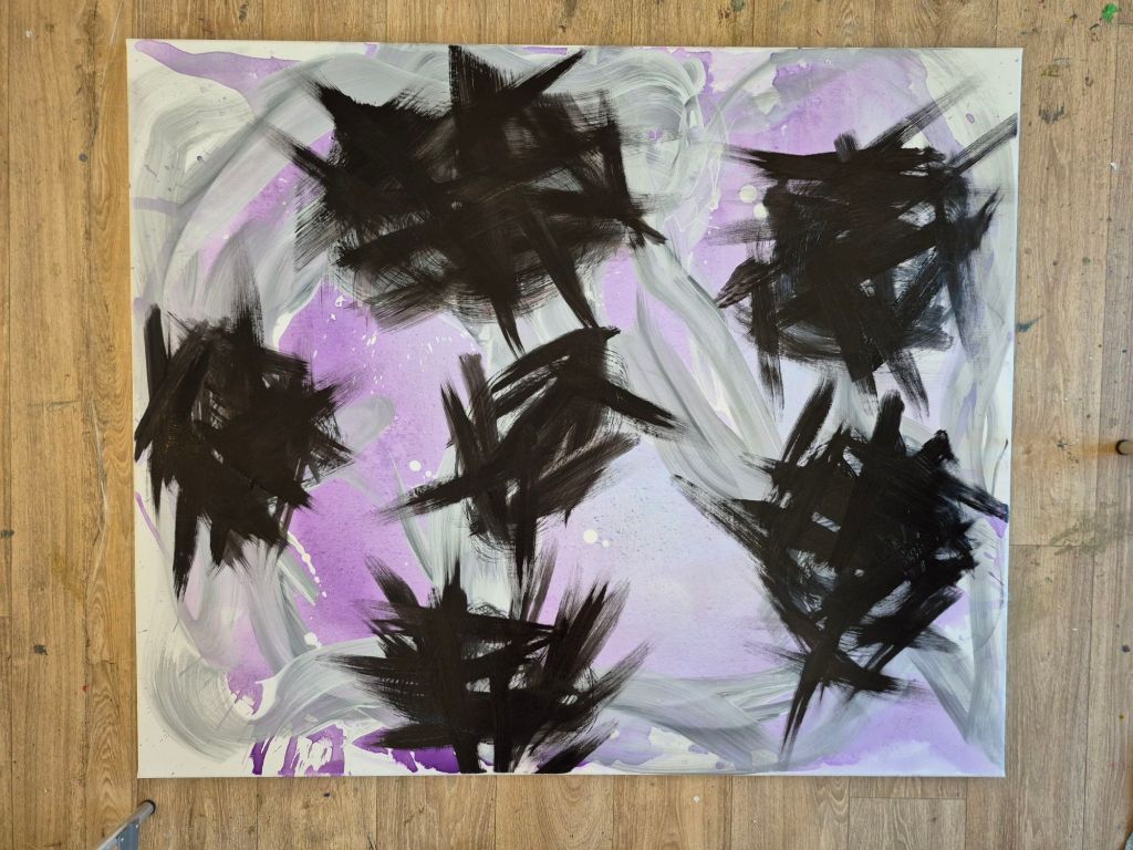
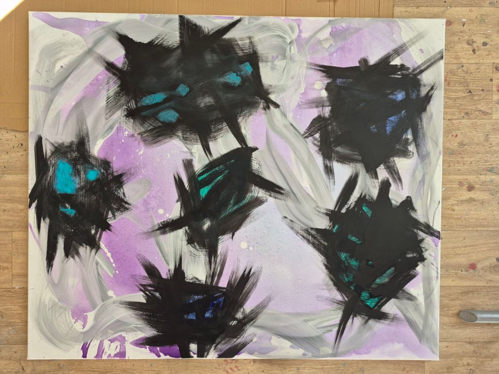
Interesting technique to get depth to the flowers – using black abstract as the base color…
Yes, we learned a lot about layers and getting depth into the paintings. So much fun!
I like the spikey blue flowers!
I’m happy you like it!
If you get time (no worries if you don’t), can you look at the painting in my modt recent post and offer sincere critique? Everyone else is blowing smoke up my ass and it’s annoying!
I will. Later to day. 🥰
I looked at your painting of the palm trees. I must say, I’m not an expert in realistic painting. This said, I think you managed the proportions and the layout quite well. You chose more subdued colors, which gives your painting a more realistic vibe. The original is, in my opinion, more kitschy. Therefore, I like your approach more. Your horizon seems not quite horizontal. It seems to drop to the sides. On the other hand your greenery is really good and realistic looking.
All in all, I find your painting quiet appealing. I know how difficult it is to copy a „perfect“ original or a vision that resides inside one’s head. So don’t be disappointed, nobody is perfect. It needs so much work to get to a place were it seems to get to a point to be happy with the result.
I hope this helps.
Thank you! I appreciate the critique! We had to do the horizons by freehand because they didn’t provide any kind of masking or straight edges (the instructor seemed annoyed). I seem to be the only one who likes the kitschy colors!! Mine is only „more realistic“ cause that’s all they supplied. One attendee tried for the same colors and ended up with a night scene! LOL. I think I’m gonna take a break from that studio’s classes. The subjects, mediums, and instructors change but the last 3 have left me upset about not matching the previews. Back to paint&sips!!
Again, thx for checking it out!!
You are welcome!
I just embiggened the first pics for the first time. Is this piece as large as it looks… like 4 feet??
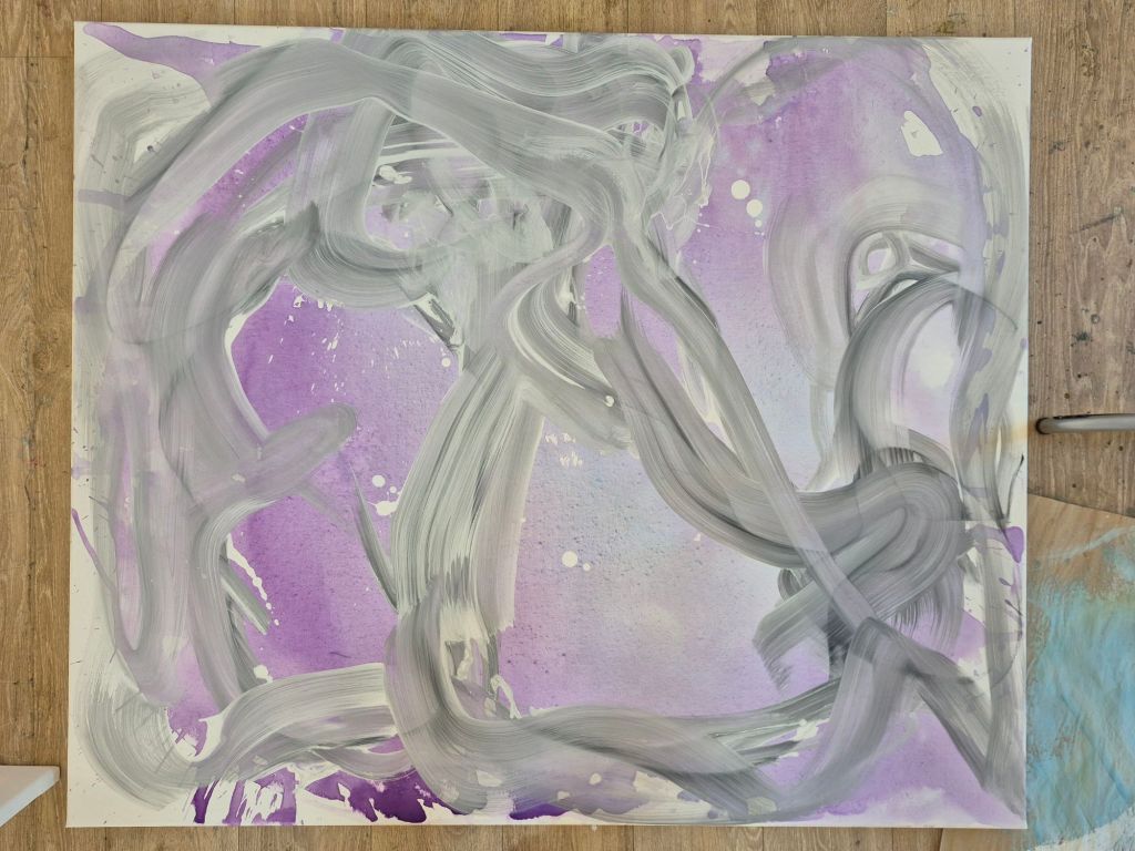
I think the one with the blue flowers is 100×120 cm. The other, the mostly white one, is 90×130 cm. I don’t know what this is in feet.
This was my first foray into bigger pieces. And it was so much fun!
Very cool! I’m scared to „waste“ canvsas, which really works against me cause I never experiment.
Something I learned this weekend. Most everything is salvageable. So be brave! Experiment!
I think I got screwed up by my first truly horrid painting being textured. I still have it to paint over. Maybe I can scrape off the textured paint… no loss if I wreck the canvas!!
Go for it!